Overview
{simplevis} uses consistent prefixes in arguments to help users to enable users to narrow down what they are looking for and then enable the Rstudio auto-complete to provide options.
In general:
- Arguments that relate to the x scale start with
x_ - Agruments that relate to the y scale start with
y_ - Arguments that relate to the colour scale start with
col_ - Arguments that relate to facetting start with
facet_
Therefore, if you know want to adjust the x scale but can’t think
how, you can start typing x_ within the {simplevis}
function, press tab, and then you will be presented with a lot of
options. You can use the arrow keys to scroll through these, and the tab
to select.
One deviation from this logic is that colour palette is selected
using a pal argument consistently in all functions
regardless of whether the colour palette relates to a colour scale or
just to everything.
Titles
Defaults titles are:
- no title, subtitle or caption
- x, y and colour titles are converted to sentence case using the
snakecase::to_sentence_casefunction.
You can customise titles with title,
subtitle, x_title, y_title and
caption arguments.
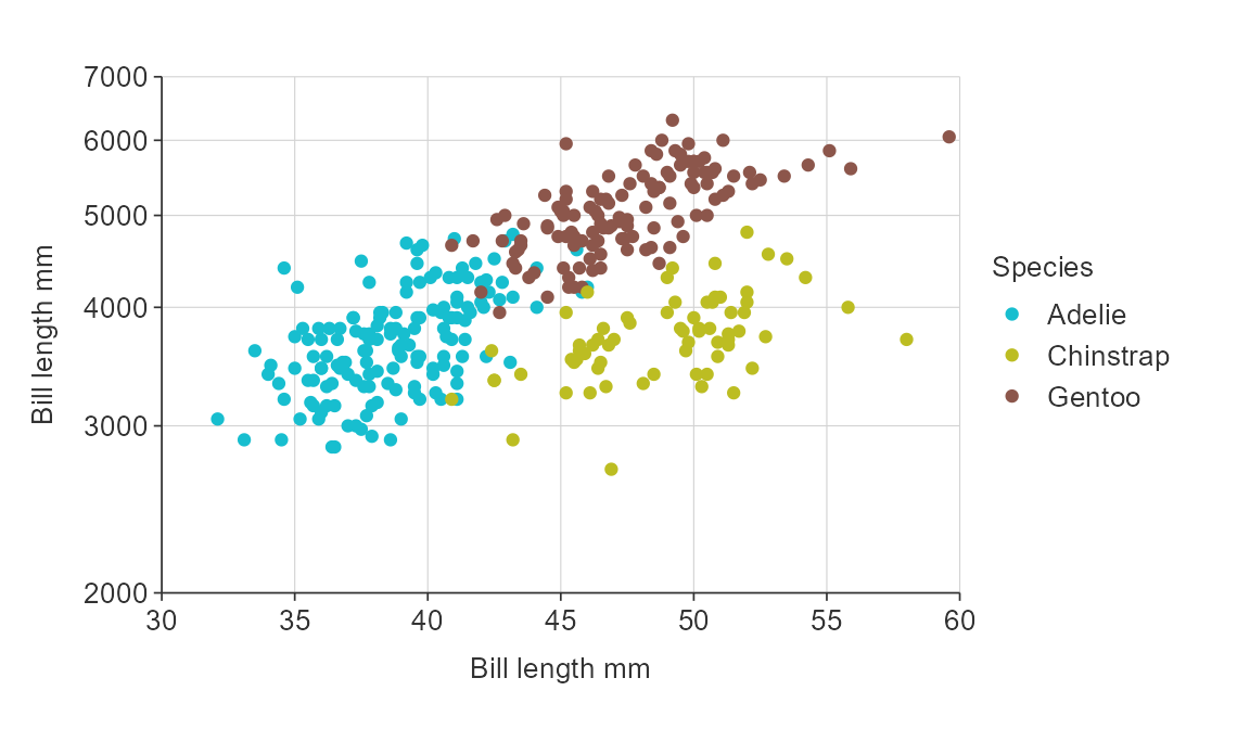
gg_point_col(penguins,
             x_var = bill_length_mm,
             y_var = body_mass_g,
             col_var = species,
             title = "Adult penguin mass by bill length and species",
             subtitle = "Palmer station, Antarctica",
             x_title = "Bill length (mm)",
             y_title = "Body mass (g)",
             col_title = "Species")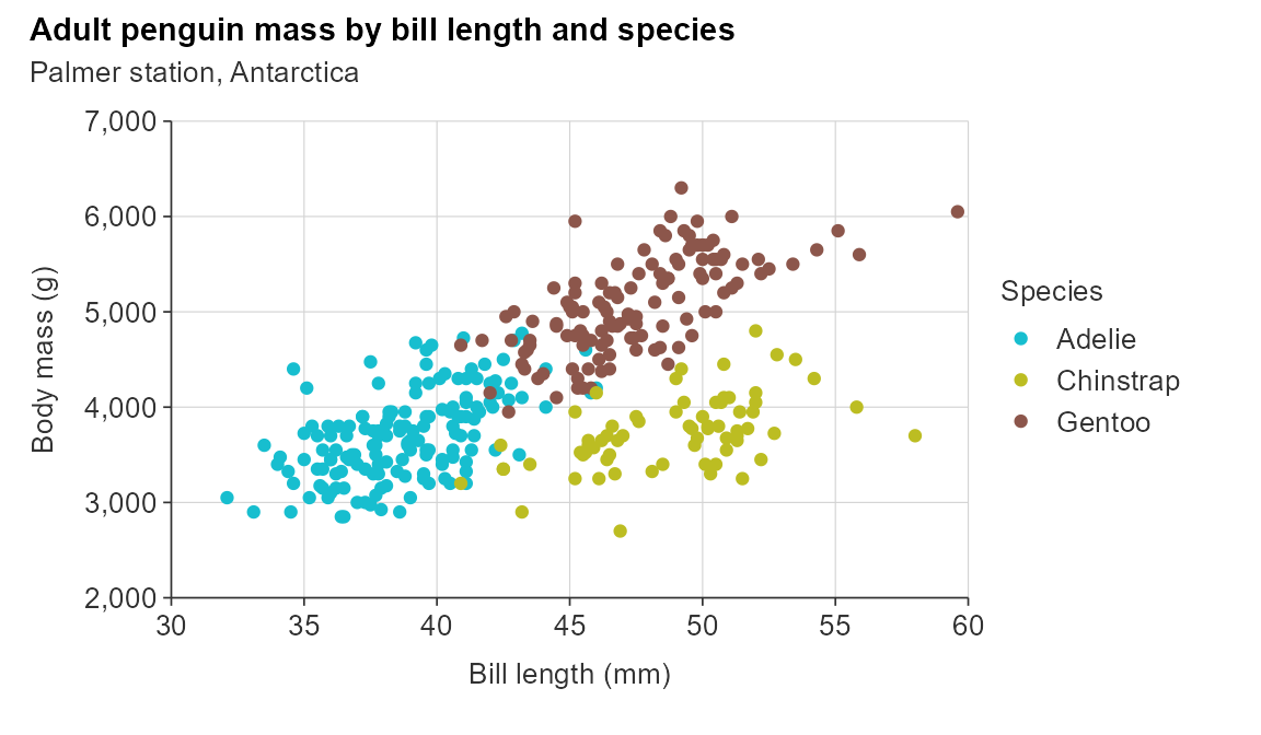
You can also request no x_title using x_title = "" or
likewise for y_title and col_title.
Labels
You can adjust labels by provinding a function or named vector to the
*_labelsargument.
All categorical variables are converted to sentence case by default
using snakecase::to_sentence_case.
Numeric variables are generally converted using the
scales::label_comma() by default, but sometimes converted
to scales::label_number().
You can turn off any {simplevis} default transformations to labels
using function(x) x.
gg_point_col_facet(penguins,
                   x_var = bill_length_mm,
                   y_var = body_mass_g,
                   col_var = sex,
                   facet_var = species)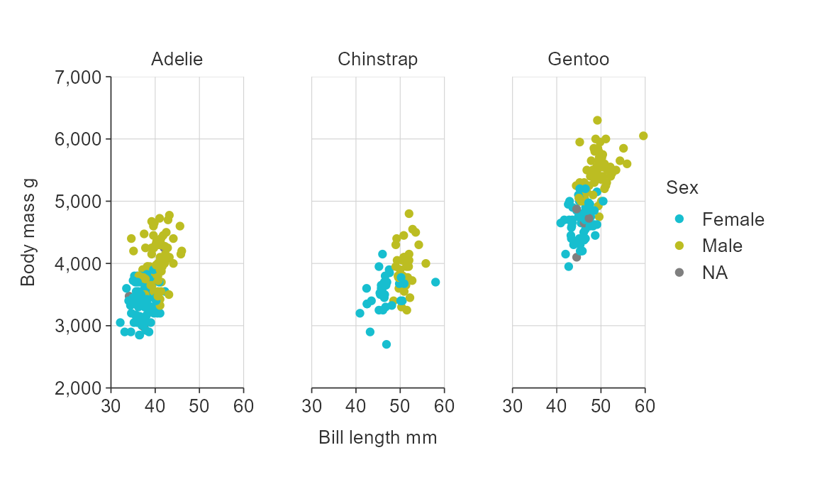
col_labels <- c("F", "M")
names(col_labels) <- sort(unique(penguins$sex))
col_labels
#> female   male
#>    "F"    "M"

gg_point_col_facet(penguins,
                   x_var = bill_length_mm,
                   y_var = body_mass_g,
                   col_var = sex,
                   facet_var = species,
                   y_title = "Body mass (kg)",
                   x_labels =  scales::label_comma(),
                   y_labels = function(x) glue::glue("{x / 1000} kg"),
                   col_labels = col_labels,
                   facet_labels = ~ stringr::str_to_upper(stringr::str_sub(.x, 1, 1)))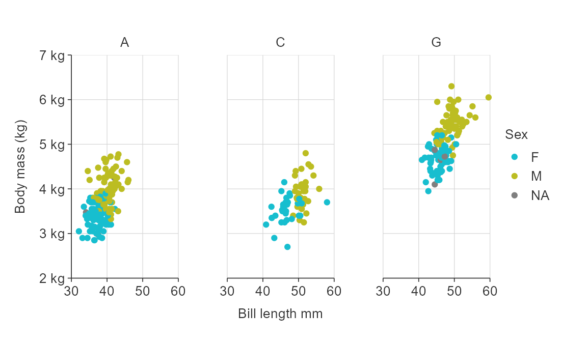
Numeric scales
{simplevis} graphs numeric scales default to:
- starting from zero for numeric scales on bar graphs.
- not starting from zero for numeric scales on all other graphs.
You can use the x_zero and y_zero arguments
to change the defaults.
gg_point_col(penguins,
             x_var = bill_length_mm,
             y_var = body_mass_g,
             col_var = species,
             x_zero = TRUE,
             y_zero = TRUE)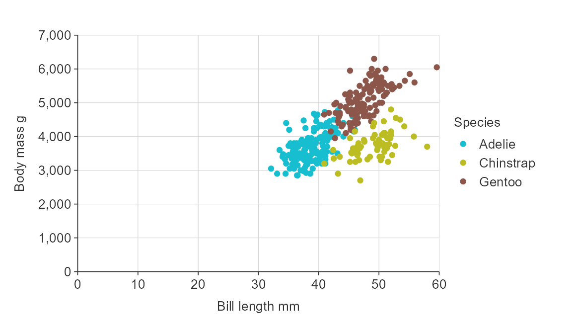
Adjust the number of breaks for numeric x and/or y scales.
gg_point_col(penguins,
             x_var = bill_length_mm,
             y_var = body_mass_g,
             col_var = species,
             x_breaks_n = 6,
             y_breaks_n = 10)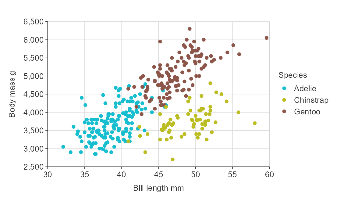
Balance a numeric scale so that it has equivalence between positive and negative values.
gg_point_col(penguins,
             x_var = bill_length_mm,
             y_var = body_mass_g,
             col_var = species,
             y_zero_mid = TRUE)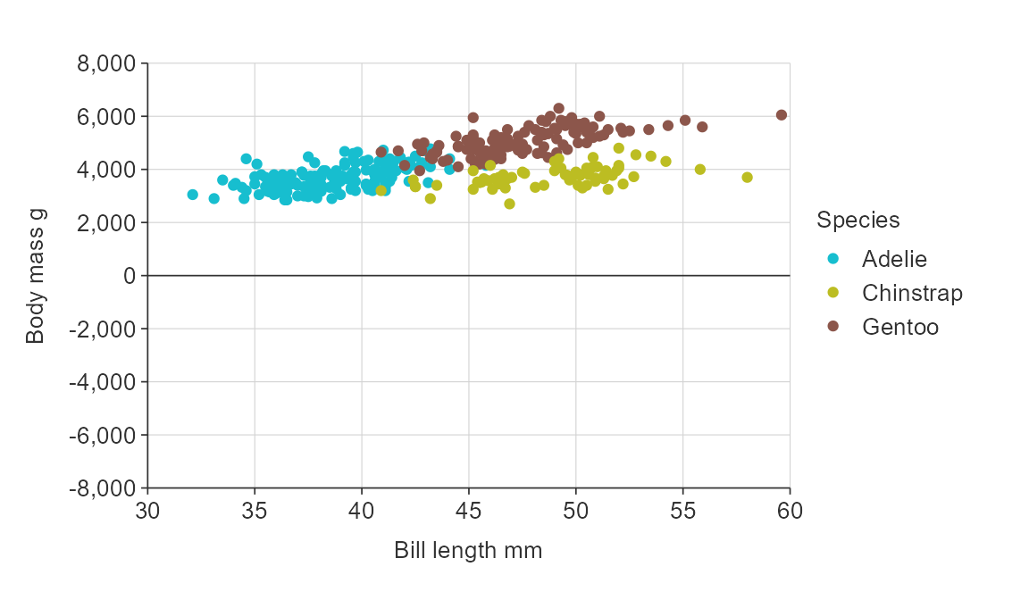
Zero lines default on if a numeric scale includes positive and negative values, but can be turned off if desired using the *_zero_line argument.
Transform numeric x and y scales by adding a ggplot2
scale_*_continuous layer.
gg_point_col(penguins,
             x_var = bill_length_mm,
             y_var = body_mass_g,
             col_var = species) +
  ggplot2::scale_y_log10(
    name = "Bill length mm",
    breaks = function(x) pretty(x, 4),
    limits = function(x) c(min(pretty(x, 4)), max(pretty(x, 4))),
    expand = c(0, 0)
) 
Discrete scales
{simplevis} automatically orders hbar graphs of character variables alphabetically.
plot_data <- ggplot2::diamonds %>%
  mutate(cut = as.character(cut)) %>%
  group_by(cut) %>%
  summarise(price = mean(price))

gg_hbar(plot_data,
        x_var = price,
        y_var = cut)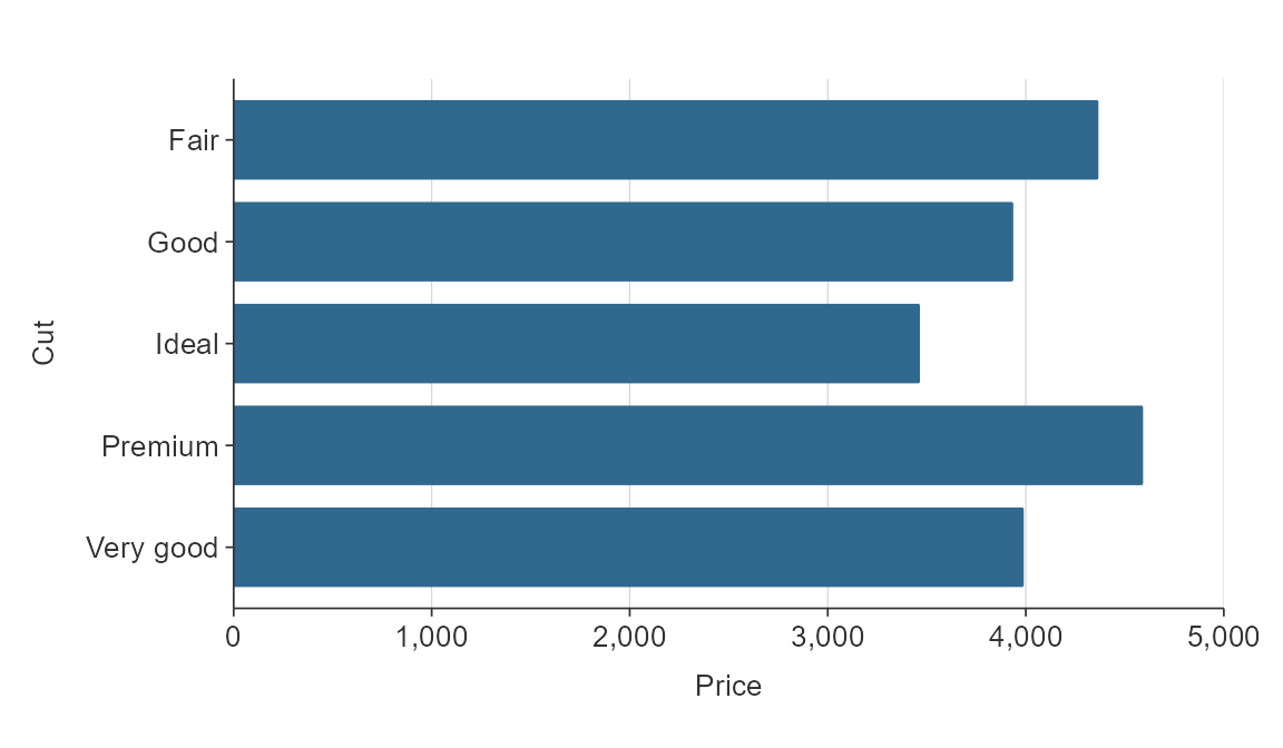
If there is an inherent order to the character variable that you want it to plot in, then you should convert the variable to a factor, and give it the appropriate levels.
cut_levels <-  c("Ideal", "Premium", "Very Good", "Good", "Fair")

plot_data <- ggplot2::diamonds %>%
  mutate(cut = as.character(cut)) %>%
   mutate(cut = factor(cut, levels = cut_levels)) %>%
  group_by(cut) %>%
  summarise(price = mean(price))

gg_hbar(plot_data,
        x_var = price,
        y_var = cut)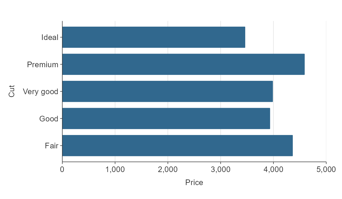
Discrete scales can be reversed easily using the relevant
y_rev or x_rev argument.
plot_data <- ggplot2::diamonds %>%
  mutate(cut = as.character(cut)) %>%
  group_by(cut) %>%
  summarise(price = mean(price))

gg_hbar(plot_data,
        x_var = price,
        y_var = cut,
        y_rev = TRUE)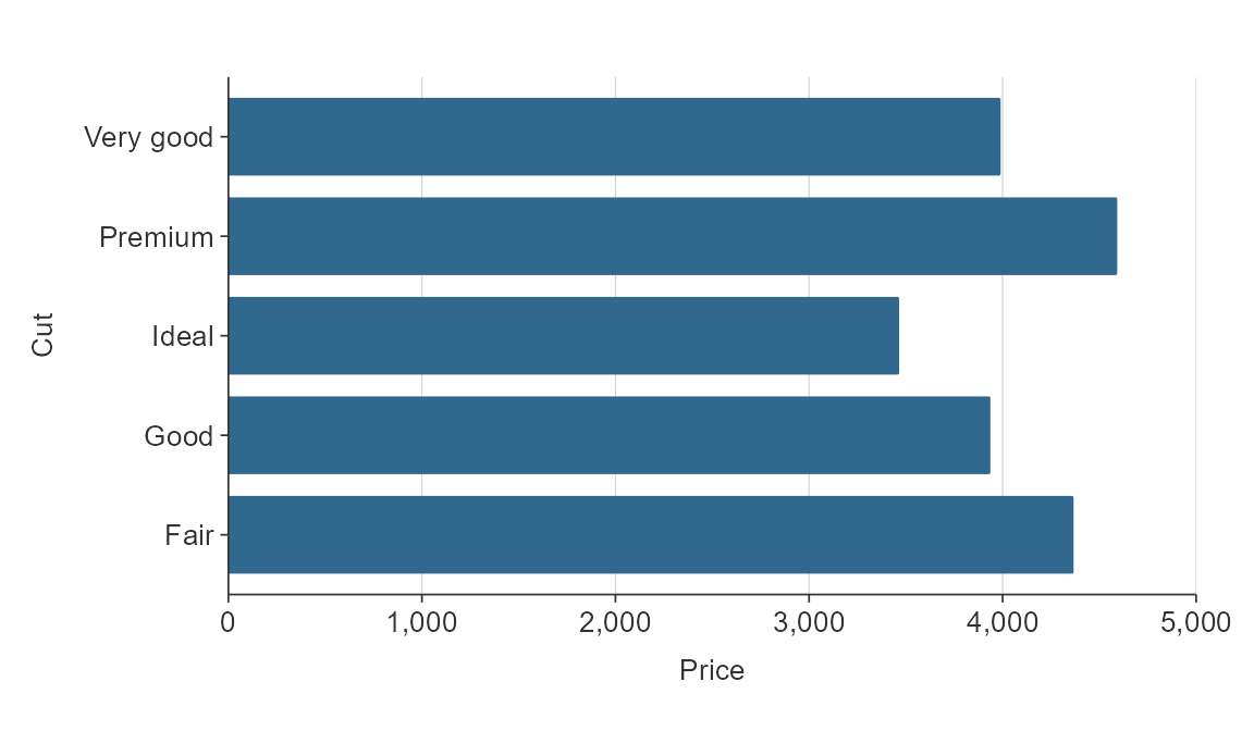
Simple hbar and vbar plots made with gg_bar() or
gg_hbar can be ordered by size using y_reorder or
x_reorder. For other functions, you will need to reorder variables in
the data as you wish them to be ordered.
plot_data <- ggplot2::diamonds %>%
  mutate(cut = as.character(cut)) %>%
  group_by(cut) %>%
  summarise(price = mean(price))

gg_hbar(plot_data,
        x_var = price,
        y_var = cut,
        y_reorder = TRUE)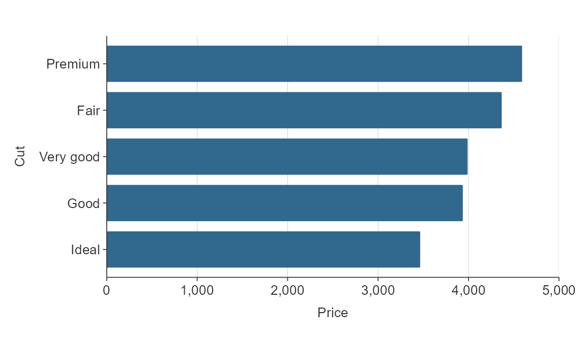
For other functions, you will need to reorder the relevant variables as you want.
The {tidytext} package provides a method for reordering within facets.
plot_data <- penguins %>%
  group_by(species, sex) %>%
  summarise(body_mass_g = mean(body_mass_g, na.rm = TRUE)) %>%
  ungroup() %>%
  mutate(species2 = forcats::fct_rev(tidytext::reorder_within(species, body_mass_g, sex)))

gg_hbar_col_facet(
  plot_data,
  x_var = body_mass_g,
  y_var = species2,
  col_var = species,
  facet_var = sex,
  facet_na_rm = TRUE,
  facet_scales = "free_y",
  y_labels = function(x) stringr::str_to_sentence(stringr::word(x, sep = "___")),
  col_legend_none = TRUE)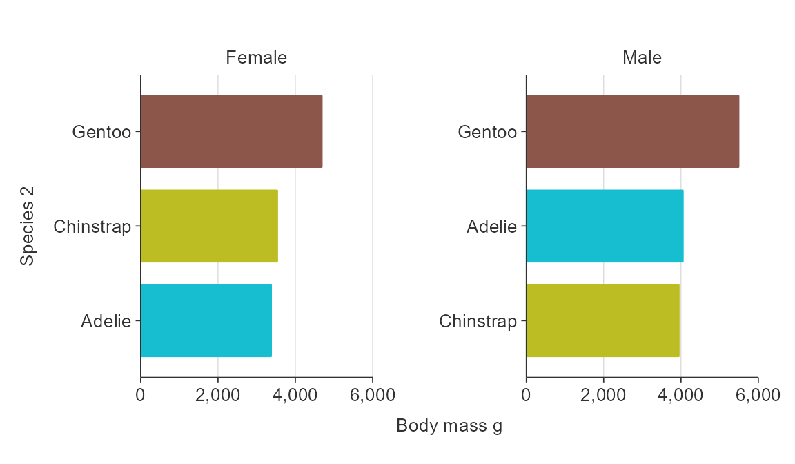
Colour scales
Customise the colour title. Note that because colour labels will be
converted to sentence case by default in {simplevis}, but we can turn
this off when we do not want this to occur using
function(x) x.
plot_data <- ggplot2::diamonds %>%
  group_by(cut, clarity) %>%
  summarise(average_price = mean(price))

gg_hbar_col(plot_data,
            x_var = average_price,
            y_var = cut,
            col_var = clarity,
            col_labels = function(x) x,
            pal_rev = TRUE)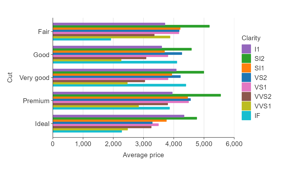
Reverse the palette.
plot_data <- ggplot2::diamonds %>%
  group_by(cut, clarity) %>%
  summarise(average_price = mean(price))

gg_hbar_col(plot_data,
            x_var = average_price,
            y_var = cut,
            col_var = clarity,
            col_labels = function(x) x,
            pal_rev = TRUE)
Reverse the order of coloured bars.
plot_data <- ggplot2::diamonds %>%
  group_by(cut, clarity) %>%
  summarise(average_price = mean(price))

gg_hbar_col(plot_data,
            x_var = average_price,
            y_var = cut,
            col_var = clarity,
            col_labels = function(x) x,
            col_rev = TRUE)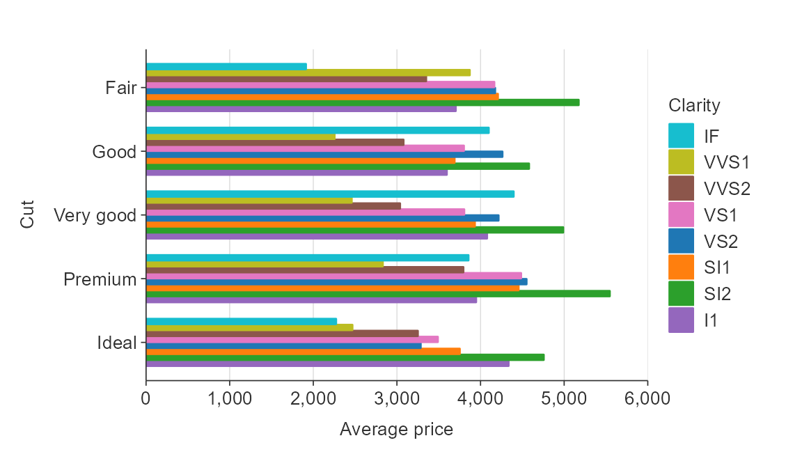
NA values
You can quickly remove NA values by setting x_na_rm,
y_na_rm, col_na_rm or facet_na_rm
arguments to TRUE.
gg_point_col_facet(penguins,
                   x_var = bill_length_mm,
                   y_var = body_mass_g,
                   col_var = sex,
                   facet_var = species,
                   col_na_rm = TRUE)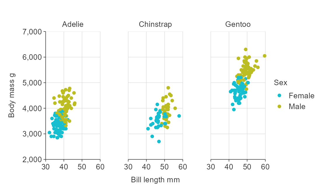
Expanding the scale
To expand the scale use x_expand and
y_expand arguments with the ggplot2::expansion
function, which allows to expand in either or both directions of both x
and y in an additive or multiplative way.
plot_data <- storms %>%
  group_by(year) %>%
  summarise(wind = mean(wind))

gg_line(plot_data,
        x_var = year,
        y_var = wind,
        x_expand = ggplot2::expansion(add = c(0, 5)),
        y_expand = ggplot2::expansion(mult = c(0, 0.025)))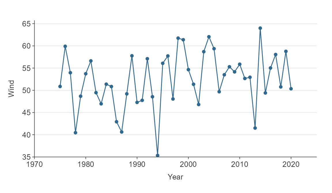
Position adjustments
In general plots are positioned exactly as the data provided.
Exceptions are bar*() and hbar*(), which
positions bars side-by-side by default (i.e. dodged).
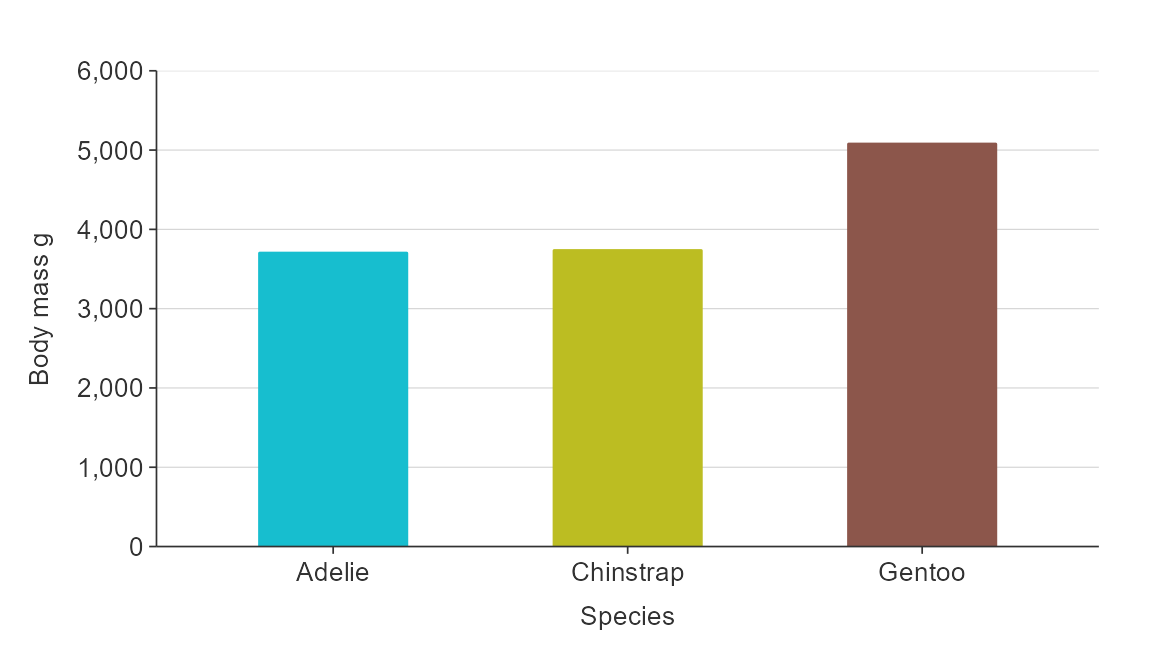
plot_data <- penguins %>%
  group_by(species, sex) %>%
  summarise(body_mass_g = mean(body_mass_g, na.rm = TRUE))

gg_bar_col(plot_data,
           x_var = species,
           y_var = body_mass_g,
           col_var = sex)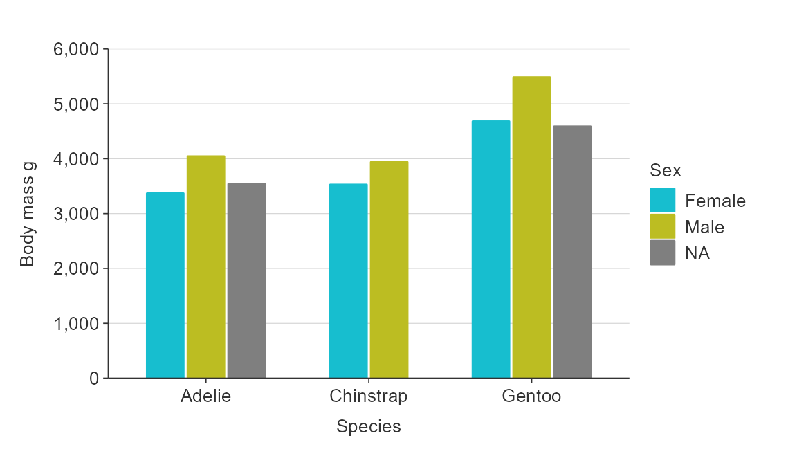
However, a option to stack bars is also available.
plot_data <- penguins %>%
  group_by(species, sex) %>%
  summarise(body_mass_g = mean(body_mass_g, na.rm = TRUE))

gg_bar_col(plot_data,
           x_var = species,
           y_var = body_mass_g,
           col_var = sex,
           stack = TRUE,
           col_na_rm = TRUE,
           width = 0.5)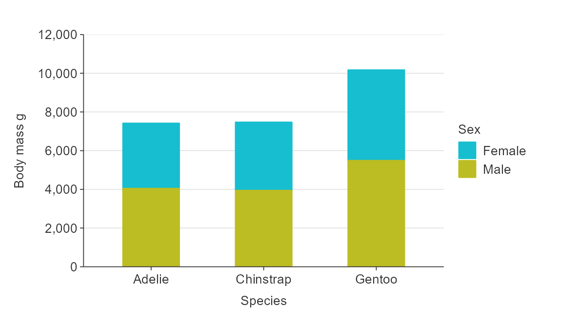
point allows you to jitter in an x or y direction.
gg_point(penguins,
               x_var = species,
               y_var = body_mass_g,
               x_jitter = 0.2,
alpha_point = 0.5) 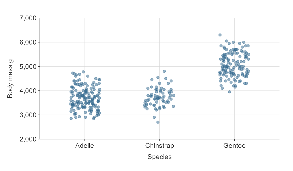
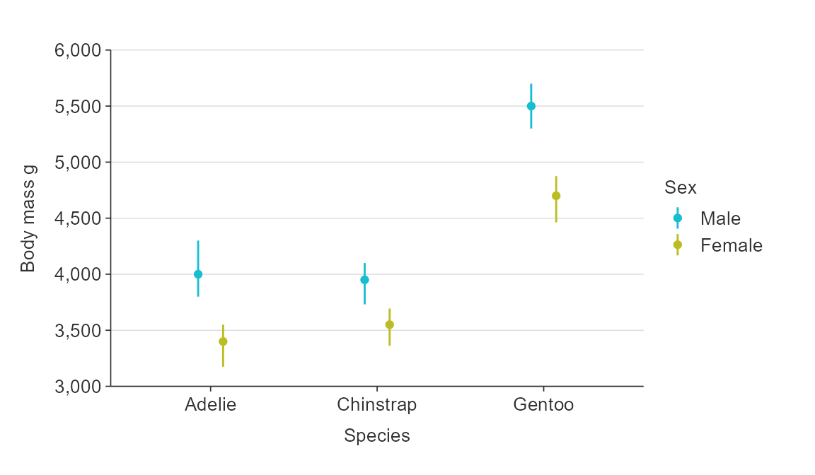
pointrange and hpointrange allow you to specify an amount to dodge by, if desired.
plot_data <- penguins %>%
  group_by(sex, species) %>%
  summarise(middle = median(body_mass_g, na.rm = TRUE),
            lower = quantile(body_mass_g, probs = 0.25, na.rm = TRUE),
            upper = quantile(body_mass_g, probs = 0.75, na.rm = TRUE))

gg_pointrange_col(
  plot_data,
  x_var = species,
  y_var = middle,
  ymin_var = lower,
  ymax_var = upper,
  col_var = sex,
  col_na_rm = TRUE,
  y_title = "Body mass g",
  x_dodge = 0.3)